Responses
Please Log In for full access to the web site.
Note that this link will take you to an external site (https://shimmer.mit.edu) to authenticate, and then you will be redirected back to this page.
Consider the following graphs, which are arranged a particular order:
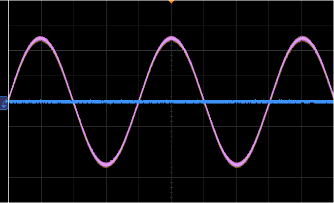
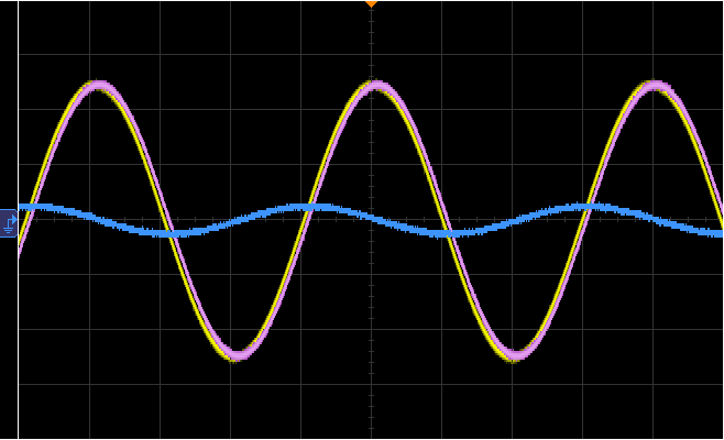
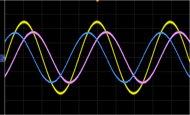
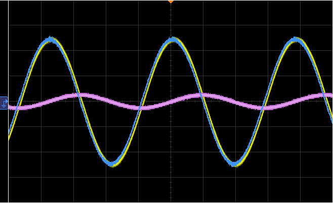
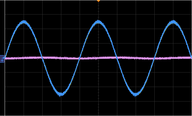
These images were generated by making measurements on the following circuit:

In each of the images:
- the yellow curve represents the input signal,
- the pink curve represents either v_{\rm R} or v_{\rm L}, and
- the blue curve represents either v_{\rm R} or v_{\rm L}.
The zoom levels have been changed on the scope so that the input wave looks the same on each graph, but each image corresponds to a different input frequency. Answer the following questions about these graphs.
Note that each question only allows one submission.
Which curve is which?

Are the graphs ordered in order of increasing frequency (with the lowest frequency on top) or in order of decreasing frequency (with the highest frequency on top)?